
Finding a foundation that looks almost right is easy. Finding one that seems to disappear into your skin is much harder.
The difference often has less to do with coverage or price and more to do with understanding what is happening underneath the visible surface of your complexion.
Skin depth tells you whether a shade is light, medium, tan, deep, or somewhere between those categories. Undertone, however, describes the subtle color that influences how foundation, concealer, blush, bronzer, and even highlighter interact with your skin.
That is why understanding how undertone analysis improves modern complexion makeup results has become so useful.
Instead of choosing products simply because they look similar to your surface skin color, undertone analysis creates a more precise system for building a believable complexion.
Once you understand whether your skin leans warm, cool, neutral, olive, or somewhere between traditional categories, complexion makeup becomes easier to balance. The result is usually less noticeable foundation, more flattering color, and skin that still looks like skin.
Understanding Skin Tone and Undertone as Two Different Things
Skin tone and undertone are often treated as interchangeable terms, but they describe different characteristics.
Skin tone refers to the visible depth of your complexion. It may change somewhat due to tanning, sun exposure, or seasonal changes. Undertone refers to the subtler hue beneath that surface and tends to remain more stable.
Allure explains that skin tone describes surface color, while undertone represents the underlying hue that may lean warm, cool, or neutral.
Warm undertones commonly contain golden, yellow, or peach influences. Cool complexions may show pink, red, or bluish characteristics, while neutral skin tends to contain a more balanced mixture.
Modern shade ranges increasingly recognize another important category: olive. Olive complexions can contain a subtle green or muted golden quality that does not always fit neatly into classic warm-versus-cool systems.
Maybelline, for example, includes olive alongside warm, cool, and neutral undertone descriptions in its foundation guidance.
Understanding these differences creates the foundation for more accurate complexion matching.
Why the Correct Foundation Depth Can Still Look Wrong
You can choose a foundation with the correct depth and still end up wondering why your face suddenly looks orange, pink, yellow, gray, or strangely disconnected from your neck.
Undertone mismatch is often the reason.
Imagine two medium-depth foundations. One contains a golden base while another contains stronger pink tones. Their depth may be nearly identical, yet they can produce completely different results on the same person.
L’Oréal’s foundation-matching guidance similarly recommends considering both complexion depth and underlying tone because ignoring undertone can produce foundation that appears too yellow, pink, or ashy.
This becomes particularly noticeable with medium-to-full coverage products. A sheer skin tint allows more of your natural complexion to show through, which can make a slightly imperfect shade more forgiving.
Opaque foundation replaces much more of the visible skin color, so undertone accuracy becomes increasingly important.
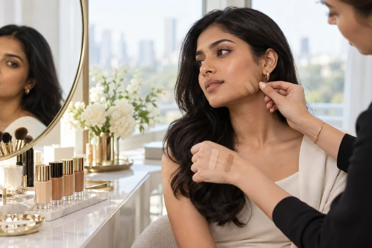
For the most realistic match, swatch two or three close options around the jawline rather than the hand. Allow them to settle for several minutes, then examine them in natural daylight. The best match should almost seem to disappear rather than merely look “close enough.”
Undertone Analysis Makes Color Correction More Precise
Color correction works by using contrasting hues to visually neutralize discoloration. However, treating every area of discoloration the same way can create unnecessary layers of makeup.
Someone with bluish-purple under-eye shadows may benefit from a peach-toned corrector. Deeper complexions may require richer peach or orange tones, while visible redness can sometimes be softened with carefully applied green correction.
The key is understanding both the discoloration and the surrounding complexion.
If the corrector is too strong for your skin depth or undertone, you may spend more time covering the corrector than correcting the original issue. That defeats the purpose.
Makeup artists interviewed by Allure have also discussed using peach or orange correction to address areas of discoloration on deeper complexions.
Apply corrective colors in extremely thin layers. The goal is not to create a visibly orange, peach, or green area. It should simply reduce the unwanted tone enough that concealer or foundation can finish the job with less product.
Concealer Looks Better When Undertone Has a Purpose
Foundation should generally blend seamlessly into the overall complexion, but concealer can serve several different purposes.
For blemishes and localized pigmentation, a concealer that closely matches both your skin depth and undertone usually produces the cleanest result. Using an overly bright under-eye concealer on a blemish can actually highlight the area.
Under the eyes, you have more flexibility.
A concealer one small step brighter may create a refreshed effect, but it should still connect naturally with the rest of the face. Someone with warm skin may prefer a subtly golden or peachy brightening concealer, while cooler skin may respond better to more neutral or softly rosy options.
The difference can be surprisingly noticeable. When the undertone works, the concealer seems integrated. When it does not, the eye area may appear unusually yellow, gray, pink, or almost detached from the cheeks.
This is one reason complexion products are better evaluated together rather than seperately.
Olive and Neutral Undertones Need Extra Attention
Traditional makeup advice often presents undertones as three neat boxes: warm, cool, and neutral.
Real skin is more complicated.
Olive complexions are a perfect example. A person can appear warm at first glance but discover that strongly yellow foundation turns orange while pink-based shades look obviously wrong. A muted green-golden influence may be the missing piece.
Allure has highlighted how dramatically foundations of similar depth can vary because of their underlying tones, particularly across deeper complexion ranges.
Neutral undertones can also be misunderstood. Neutral does not necessarily mean that every foundation will match. Some neutral complexions lean slightly warm, cool, peach, or olive, so experimentation is still necessary.
This is where direct swatching becomes more reliable than simple rules about veins or jewelry.
Vein tests can provide clues – Healthline notes that blue or purple-looking veins are commonly associated with cooler undertones while greener-looking veins may indicate warmth – but no single test should be treated as an absolute diagnosis.
Skin is simply more nuanced than that.
Blush and Bronzer Become Easier to Balance
Undertone analysis is not only useful for foundation.
It can dramatically improve how blush, bronzer, and contour products work together.
Warm complexions often harmonize naturally with peach, terracotta, apricot, coral, and warm rose tones. Cooler complexions may suit berry, mauve, cool pink, plum, or blue-based rose shades, while neutral skin has plenty of flexibility.
That does not mean you are banned from using colors outside your undertone family. Makeup is creative, not a mathematical formula.
The difference is intention.
Choosing a harmonious blush creates an effortless skin-like flush. Choosing a deliberately contrasting shade creates more visual impact. Once you understand the difference, you can control the result instead of wondering why a beautiful blush looks unexpectedly orange or dull on your face.
Bronzer requires similar attention. A bronzer that is excessively orange on cool or olive skin can look artificial, while something too gray may drain the warmth from a naturally golden complexion.
The aim is balence rather than simply making the face darker.
Undertone Can Change How a Complete Makeup Look Feels
Complexion products create the visual background for everything else on the face.
If that background is poorly matched, even expertly applied eye makeup or lipstick may feel slightly disconnected. When foundation, concealer, blush, and bronzer share a believable relationship with the natural complexion, the entire look becomes more cohesive.
Undertone awareness is especially useful when building minimal makeup. With fewer products on the face, inaccurate shades become easier to notice.
It also helps when shopping across different brands because undertone terminology is not perfectly consistant. One company’s “warm” foundation may appear more golden, while another may interpret warmth as peach.
Clinique, for instance, uses undertone labeling within its foundation ranges to help distinguish shade families rather than relying only on depth names.
Treat labels as a starting point, not an unquestionable rule. Your skin is ultimately the best reference.
Use Natural Light as the Final Undertone Test
Artificial lighting can completely change how complexion colors appear.
Warm indoor bulbs may make a foundation seem more golden, while cool lighting can make the same shade look flatter or pinker. Store lighting can be even more confusing.
Whenever possible, check your final shade in indirect daylight.
Look at the face, jawline, neck, and upper chest together rather than focusing on one tiny swatch. Your face may naturally contain redness, pigmentation, or different tones, so matching foundation exclusively to the cheek is not always ideal.
Give the product time to dry as well. Some formulas can shift slighly after application because of drying, skin oils, or interactions with skincare.
The best modern complexion makeup should not create one perfectly uniform block of color. It should gently unify the face while allowing natural variations in the skin to remain believable.
Understanding undertone is one of the simplest ways to make complexion makeup look more sophisticated without applying more product.
It improves foundation matching, helps color correction work more efficiently, makes concealer easier to integrate, and gives blush and bronzer a more intentional relationship with the skin.
Rather than relying exclusively on warm, cool, or neutral labels, pay attention to how products actually behave on your face. Olive influences, pigmentation, seasonal skin-tone changes, and individual color variations can all affect the final result.
The next time you shop for foundation, compare several shades with similar depth but different undertones along your jawline. That small experiment may reveal why previous matches never looked completely seamless – and help you create a far more natural complexion.