
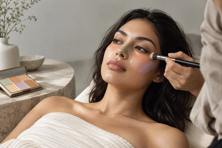
Sometimes foundation is not the real solution to uneven skin tone. You can keep adding coverage over redness, dark circles, pigmentation, or dull areas, yet the complexion still looks heavy rather than genuinely balanced.
That is where colour correction becomes useful.
Advanced colour correction for balanced and even complexion tone uses color theory to neutralize unwanted tones before foundation and concealer do the final blending.
Instead of covering discoloration with several opaque layers, you apply a small amount of an opposing color to visually reduce the problem first.
Green can soften visible redness, while peach and orange tones can counteract blue-gray or purple discoloration. Yellow and lavender correctors also have specific purposes depending on the underlying tone.
The advanced part is not simply memorizing a color wheel. Skin depth, undertone, product intensity, texture, and placement all affect whether correction looks seamless or obvious.
When those factors work together, you can often achieve a more natural-looking complexion with significantly less foundation.
Understand the Color Theory Behind Correction
Colour correction is based on complementary colors – tones positioned opposite one another on the traditional color wheel.
When strategically layered, opposite shades can visually neutralize each other. Green counteracts red, while warm peach or orange hues can balance blue and purple discoloration. Yellow can soften violet tones, and lavender may help brighten areas that appear excessively yellow or dull.
L’Oréal Paris describes colour correcting as a way of using opposing colors to balance visible discoloration before conventional complexion products are applied.
However, the objective is not to create perfectly colorless skin.
Real complexions contain naturally occurring reds, yellows, browns, olives, and pinks. Removing every variation can make makeup appear flat. Correction works best when it reduces distracting discoloration while preserving enough variation for the face to remain believable.
Think of it as adjusting the color balance rather than repainting the entire complexion.
Use Green Corrector Only Where Redness Is Strong
Green is probably the most recognizable colour corrector, but it is also easy to overuse.
Because green sits opposite red on the color wheel, a small amount can soften the appearance of blemishes, irritation, or localized redness. The American Academy of Dermatology also notes that green-tinted concealer can camouflage redness associated with rosacea.
The important word is small.
If you apply an obvious green layer across the entire face when redness is only concentrated around the nose and cheeks, you may create a dull or slightly gray complexion that requires more foundation to correct.
Instead, place green directly where redness is strongest and diffuse the edges.
For widespread mild redness, a sheer color-correcting primer may make more sense than a highly pigmented spot corrector. For an individual blemish, a tiny precise dot is generally easier to control.
If your skin is sensitive or rosacea-prone, apply makeup gently instead of repeatedly rubbing the area. The AAD recommends avoiding excessive friction because irritation can worsen sensitive, redness-prone skin.
Choose Peach or Orange Based on Skin Depth
Under-eye circles provide a good example of why one corrector shade does not work for everyone.
Bluish, purple, and gray shadows often respond well to warm peach or orange correction. However, the intensity of that warmth should usually increase as complexion depth becomes deeper.
A pale peach may work beautifully on fair or light skin but appear almost chalky on a deep complexion. Conversely, a highly saturated orange corrector may overwhelm lighter skin.
L’Oréal’s guide recommends peach tones for lighter complexions and deeper orange variations for medium-to-deep skin when addressing dark circles and dark marks. Maybelline provides similar guidance based on the color of the discoloration being corrected.
Apply the corrector primarily over the darkest section rather than automatically covering the entire under-eye area.
For many people, that means concentrating product near the inner corner and along the deepest shadow.
Once the blue-gray tone has been softened, a thin layer of skin-toned concealer can usually finish the correction. This often looks fresher than trying to hide everything with thick concealer alone.
Treat Hyperpigmentation Differently From Under-Eye Darkness
Dark spots, post-acne marks, and other areas of hyperpigmentation may resemble under-eye shadows, but they do not always need exactly the same strategy.
First, examine the actual color.
Some marks appear brown, while others contain blue-gray, purple, red, or even slightly ashy undertones. A warm peach corrector may be enough for lighter discoloration, while deeper orange or reddish-orange tones can work better on stronger blue-gray pigmentation in deeper skin.
The biggest mistake is applying a large circle of correction around a tiny mark.
Use a small brush and place the pigment directly over the discoloration. Blend only the outer edge so you maintain maximum correcting power in the centre.
Allow the product to settle briefly before applying foundation or concealer over it.
This precision technique prevents the surrounding skin from becoming unnecessarily warm and keeps your overall base thinner. The correction should be nearly invisible underneath the final complexion products, not create an obvious coloured patch.
Use Yellow and Lavender More Strategically
Green, peach, and orange receive most of the attention, but yellow and lavender can also be useful.
Yellow corrector can help neutralize certain purple or violet areas. L’Oréal specifically recommends yellow for purple-toned discoloration, with softer yellows for fair complexions and richer golden versions for deeper skin tones.
Lavender works differently.
Because purple opposes yellow, lavender-toned correctors can brighten areas that appear unusually sallow or overly yellow. They may be particularly helpful when the goal is creating fresher-looking luminosity rather than covering a specific blemish.
These shades require restraint.
Applying a thick lavender primer over warm or olive skin, for example, can create an unnatrual cast rather than healthy brightness. Similarly, overly yellow correction can make certain undertones look artificially golden.
Advanced correction means matching the strength of the correcting pigment to the strength of the discoloration.
Mild problems generally require mild solutions.
Consider Your Natural Undertone Before Correcting
A color corrector does not exist independently from the rest of your complexion.
Your natural undertone affects how strongly a correcting shade appears. Someone with naturally warm golden skin may absorb peachy correction very easily, while the identical product may look noticeably orange on a cooler complexion.
Olive skin introduces another layer of complexity because it can already contain muted green-golden characteristics. Applying too much green correction can therefore make certain areas appear unusually gray.
This is why generic instructions should be treated as starting points rather than strict rules.
Test the smallest possible amount and observe how it interacts with your skin before adding more.
It also helps to separate correction from brightening. A brightening concealer is designed to make an area look lighter or more illuminated, while colour correction specifically targets unwanted hue.
L’Oréal’s concealer guidance, for example, differentiates between skin-matching concealers, brighter under-eye shades, and green or peach-orange correctors used for stronger discoloration.
Understanding that difference prevents product overload.
Keep Correcting Layers Thin Under Foundation
The most sophisticated color correction is usually the least visible.
After skincare and primer, apply corrector only where necessary. L’Oréal’s makeup-order guidance places color correction before foundation so the correcting tones can integrate into the final complexion rather than sitting visibly on top.
Start with less product than you think you need.
Press or stipple instead of aggressively sweeping the corrector around. Once the unwanted color appears softer, stop.
Foundation should then be added in a thin layer. Avoid buffing so aggressively that you remove the correction underneath.
If necessary, add a skin-toned concealer as the final concentrated layer.
This approach can dramatically reduce the amount of foundation required because you are no longer asking one beige-toned product to cover every red, blue, purple, and brown variation at once.
The final result tends to look more dimentional because some natural complexion variation remains visible.
Avoid the Most Common Colour-Correcting Mistakes
More corrector does not equal more correction.
One of the most common mistakes is using a shade that is significantly more intense than the discoloration itself. You then need heavy foundation to cover the corrector, which defeats the entire purpose.
Another mistake is correcting areas that do not actually require it.
A slight natural flush through the cheeks can make skin look healthy. Neutralizing every hint of red may leave the complexion unusually flat.
Texture also matters. Under-eye areas with fine lines generally respond better to thin, flexible products than thick layers of creamy pigment. Raised acne should be corrected for color, but makeup cannot physically flatten the bump.
The most effective routine is therefore highly targeted.
Correct the obvious discoloration, blend carefully, and leave everything else alone. If you can clearly see green, orange, or purple after foundation is applied, you probably used too much or chose a shade that was too saturated.
Subtlety is what makes advanced correction look profesional.
Advanced colour correction is less about collecting every shade on the color wheel and more about learning when each one is genuinely useful.
Green can soften significant redness, peach and orange can balance blue-purple darkness, yellow can address violet tones, and lavender can revive certain dull or overly yellow areas.
Skin depth, undertone, texture, and the intensity of discoloration should determine how much corrector you use.
Most importantly, keep every layer thin. The goal is to reduce the amount of foundation and concealer required, not create another heavy layer underneath them.
Next time you notice uneven tone, identify the actual color first before automatically reaching for more foundation. A tiny amount of precisely chosen corrector may create a smoother, lighter, and far more natural complexion.